PARADISE
IBIZA
How do you sell a festival before the lineup drops? You sell the world around it. We crafted the mythology, I shaped it for social, turning momentum into identity, curiosity into commitment.
How do you sell a festival before the lineup drops? You sell the world around it. We crafted the mythology, I shaped it for social, turning momentum into identity, curiosity into commitment.


If Temples of the Sun were a person, they would be a celestial curator of energy and experience, lighting the path to unity and transcendence. A figure who seamlessly weaves the mystical with the modern, they ignite joy, connection, and positivity in those who join them on their radiant journey.
Visual Impact isn’t about throwing in effects or making something “pop” it’s about being strategic. It’s about stopping power, clarity, and emotional connection. That’s what makes a campaign cut through the noise and actually stick.
Phlegm
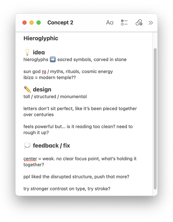
We chose for its hand-crafted, organic serif style that exudes a sense of ancient mysticism and celestial energy. We explored how Its bold, sculptural forms evoke raw, powerful essence of sun-worshipping rituals.

Editorial New - Italic
We chose a supporting font to balance the bold logo typeface. Italics felt right, it adds flow and softness. The stroke movement creates subtle motion, tying seamlessly into the photoshoot.

Helvetica Neue
For the lineup typeface, legibility was the top priority. We know the lineup is a key factor in whether festival-goers decide to attend. We tested Helvetica Neue across digital and print, and it held up perfectly, scalable, sharp, and never overpowering the rest of the design.

We wanted the theme reveal to feel like a slow burn, teasing just enough to spark curiosity and pull people in.
The goal is to build mystery, make it feel like something big is coming. By leaning into visual drama, we’ll set the tone early and own the conversation before Ibiza season even kicks off.

Playing with lack of visibility
Emphasising the Cosmic Glow
Focusing on Mood, Not Details

Inspiration
Inspired by dawn, using a soft fade-in to build anticipation. Aiming to create a gradual reveal that feels immersive with the artwork

Explored Refinements
First 5sec are crucial to grab viewer attention. Lineup visibility is the main message here must be immediate to reduce drop-off rate
Test flashier transition, the aim is to communicate the hype and energy while showcasing the lineup
Engagement Data
73%
High Drop-Off Rate
B (Static Asset)
2.5%
High Drop-Off Rate
0.8%
Low Click-Through Rate
38%
Low Click-Through Rate


62%
Retention Rate

22%
View-Through Rate

Half the work is designing.
The other half is making it work everywhere.

A campaign isn’t a single moment
it’s an ecosystem. Every piece must connect, every detail must serve a purpose.


